Chronotope’s avatarChronotope’s Twitter Archive—№ 84,217

    1. The slow deconstruction of News sites to look more like Medium makes me feel ill every time I see another example.
  1. …in reply to @Chronotope
    Readers use a distinct visual brand to identify and establish trust in a company in more respects than just a logo.
    1. …in reply to @Chronotope
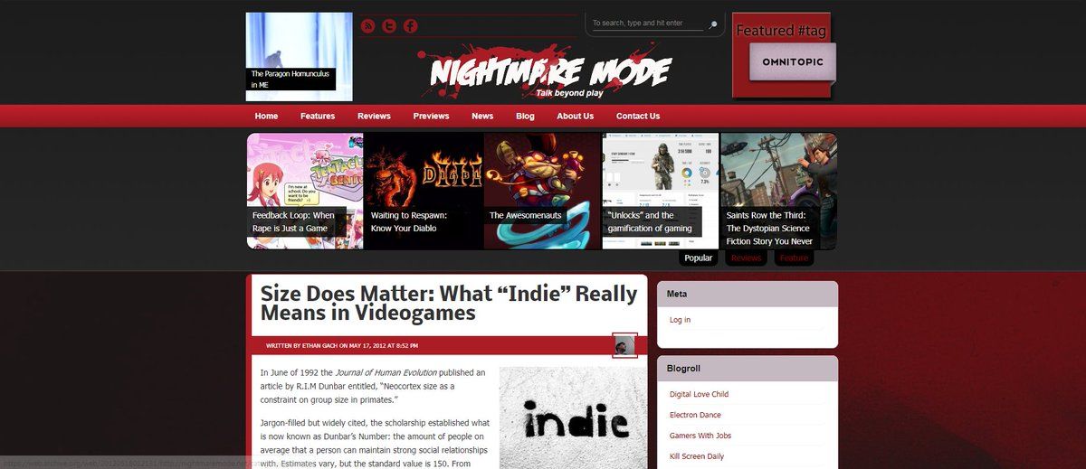
      This is still one of my favorite designs of sites I've built. It's distinctive, well-organized, heavily informed by UX eyetracking, has a good use of empty space, and high but not overwhelming information density.
      oh my god twitter doesn’t include alt text from images in their API
      1. …in reply to @Chronotope
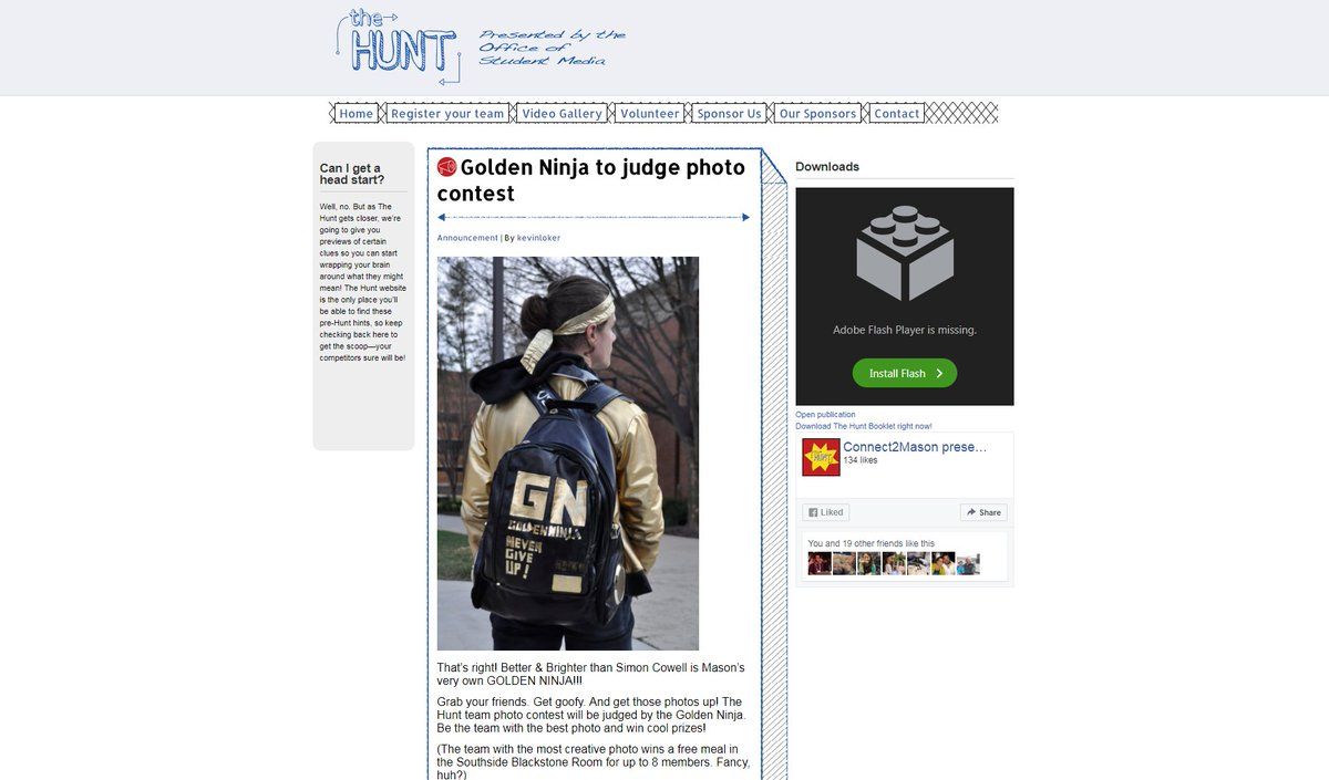
        Also a design I built out that I rather liked. Simple, but uses space with prioritization and thought. Spacing works with background to clearly show a visual theme and a distinct look.
        oh my god twitter doesn’t include alt text from images in their API
        1. …in reply to @Chronotope
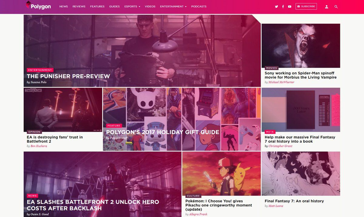
          Polygon's front page, btw, is still one of my absolute favs
          oh my god twitter doesn’t include alt text from images in their API
          1. …in reply to @Chronotope
            AMP makes this problem only worse. Same with FBIA, because they purposefully limit design and push all layouts to look the same.


Search tweets' text