-
whoa... what happened to Roll Call's layout?Permalink On twitter.com
 Mood 0
-
This is such a typically UX-blind bad layout.Permalink On twitter.com
 ❤️ 2 Favorites
Mood -3 🙁
❤️ 2 Favorites
Mood -3 🙁
-
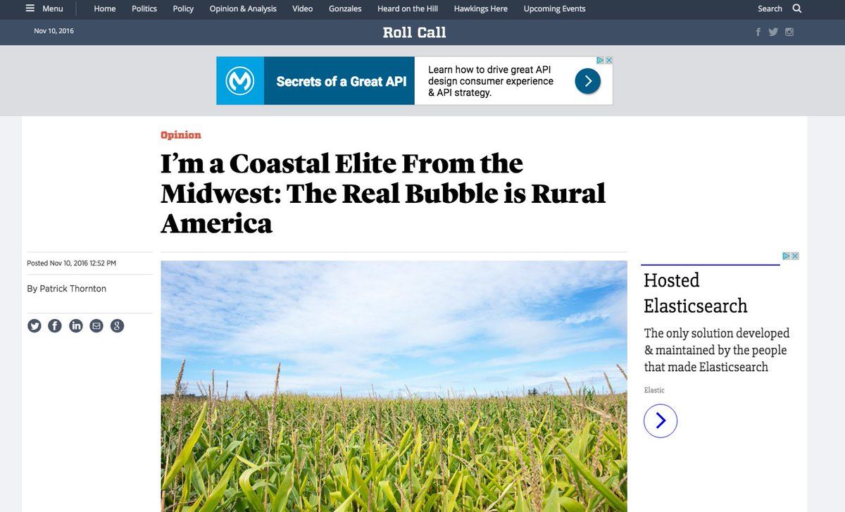
I don't know what site I'm looking at b/c title small, center aligned. Date is before it for some reason. Almost no data in first scroll.Permalink On twitter.com
Mood -1 🙁
-
First scan gives me a dateline and byline. Neither of which I care about. This image conveys no data. What is this article about? I dunno.On twitter.com
❤️ 1 Favorite
Mood +1 🙂
-
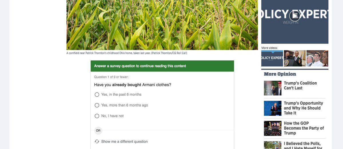
Then, first scroll, I have to answer survey b/f getting anything but image. If this wasn't linked by someone I trusted I would bouncePermalink On twitter.com
 Mood +2 🙂
-
There isn't even a conversion opportunity in the first eyeline on the first scroll, much less initial layout.Permalink On twitter.com
❤️ 1 Favorite
Mood +2 🙂
-
I'm picking on Roll Call b/c they're stupid survey, but this is a pretty common set of layout issues. So bad.Permalink On twitter.com
❤️ 1 Favorite
Mood -4 🙁
-
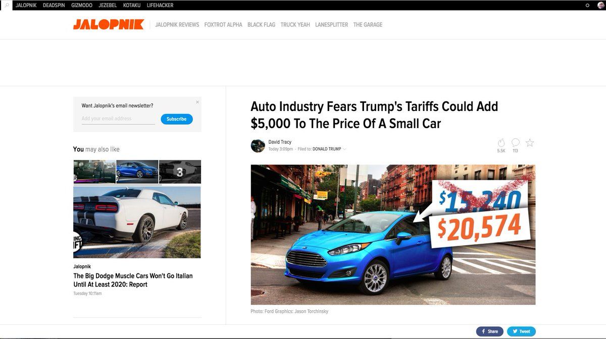
Look at the first scroll in a Gizmodo property as a contrast: - Informational image.Permalink On twitter.com
 ❤️ 1 Favorite
Mood 0
❤️ 1 Favorite
Mood 0
-
- First thing I see contextualizes w/related content & gives me a conversion opportunity if I don't like the hed.Permalink On twitter.com
♻️ 1 Retweets
❤️ 1 Favorite
Mood 0
-
- Immediate CTA. - Headline takes up less space. - Byline w/human face on it. - Dateline uses taxonomy to tell me what this is about.Permalink On twitter.com
❤️ 1 Favorite
Mood 0
-
First scroll has an annoying ad placement, but otherwise isolates the content to make the first part I read easy to see and not distract mePermalink On twitter.com
 Mood +1 🙂
-
Look at how *much* space there is between the ad and the content. This stuff matters.Permalink On twitter.com
❤️ 1 Favorite
Mood +1 🙂
-
I wonder if there is a rule at Gizmodo Media to make most preview images either informational or have a human face in them.Permalink On twitter.com
❤️ 2 Favorites
Mood 0
-
This stuff matters folks.Permalink On twitter.com
Mood +1 🙂
-
You know who does information density *really* well? Meetup. Look at an event on Meetup and see how much you can take in cleanly at a glancePermalink On twitter.com
❤️ 1 Favorite
Mood 0